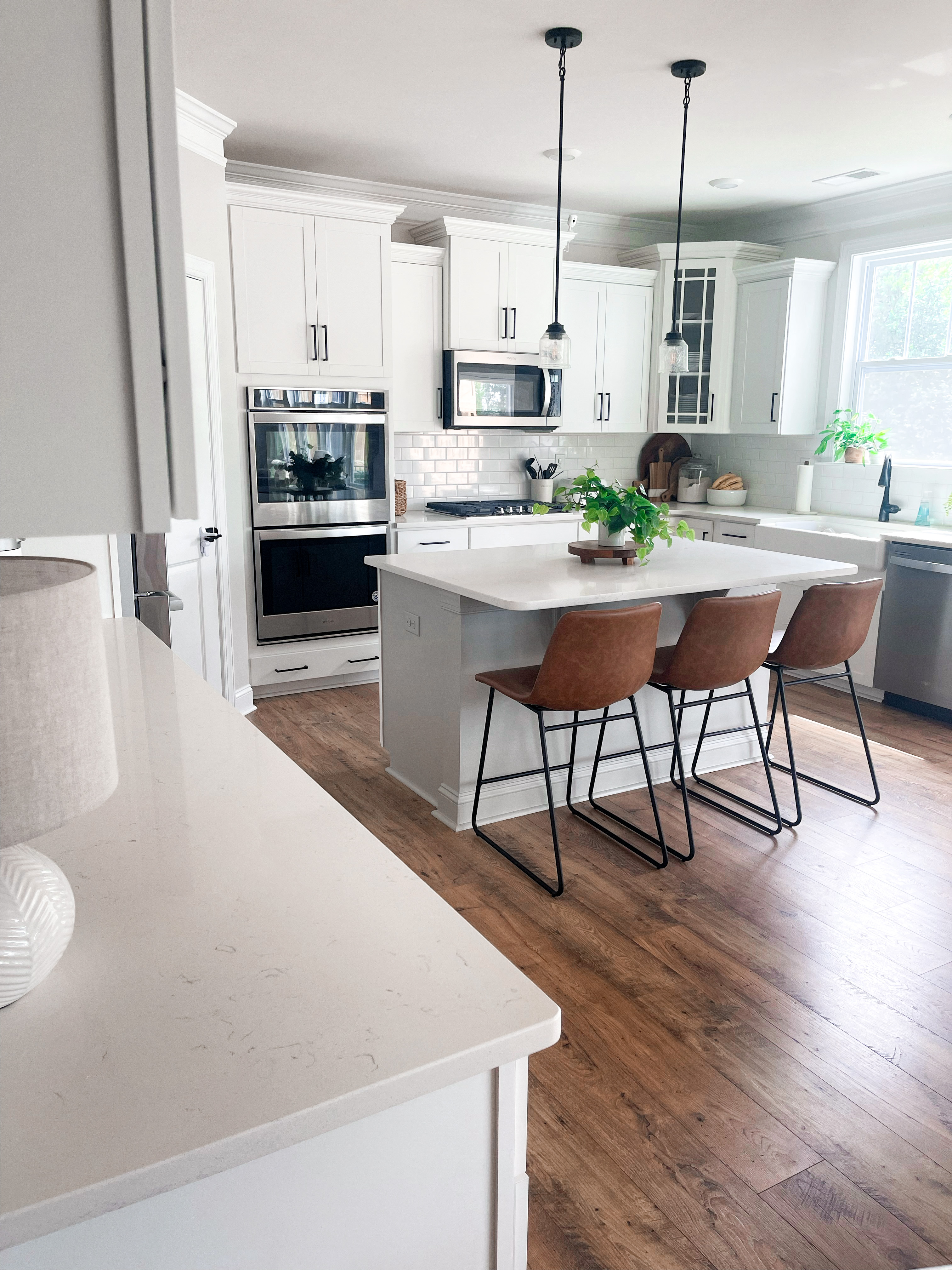
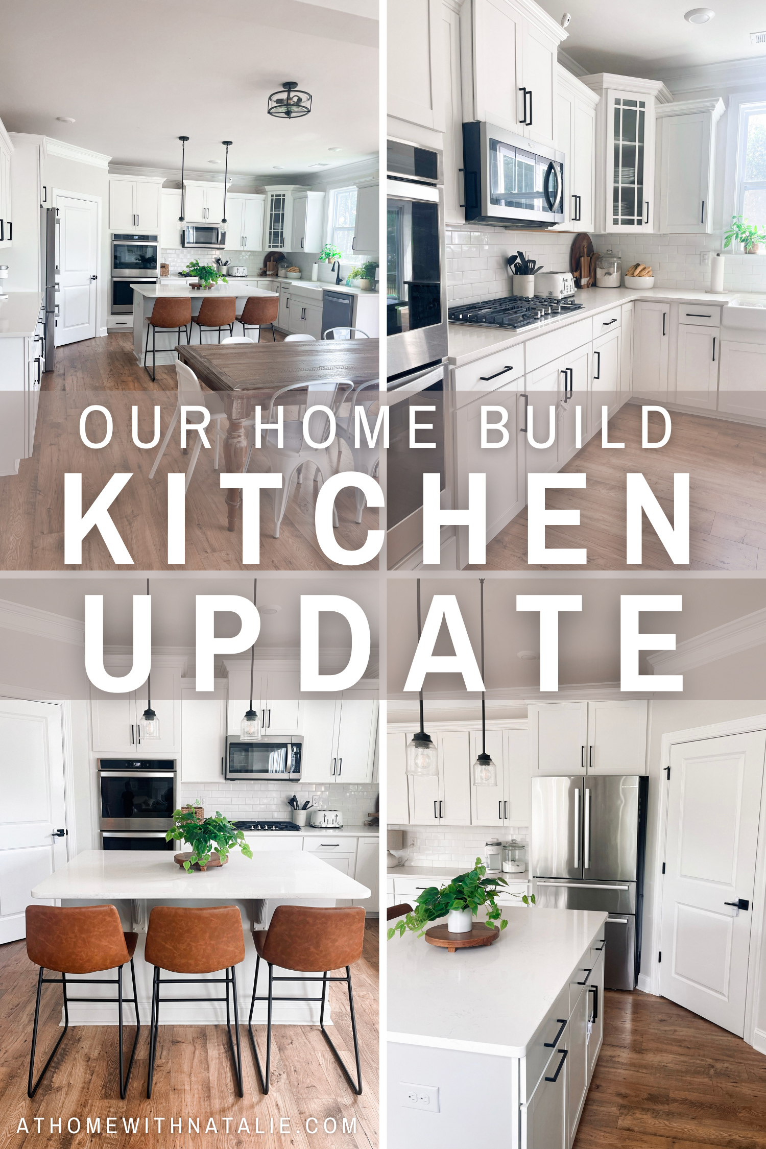
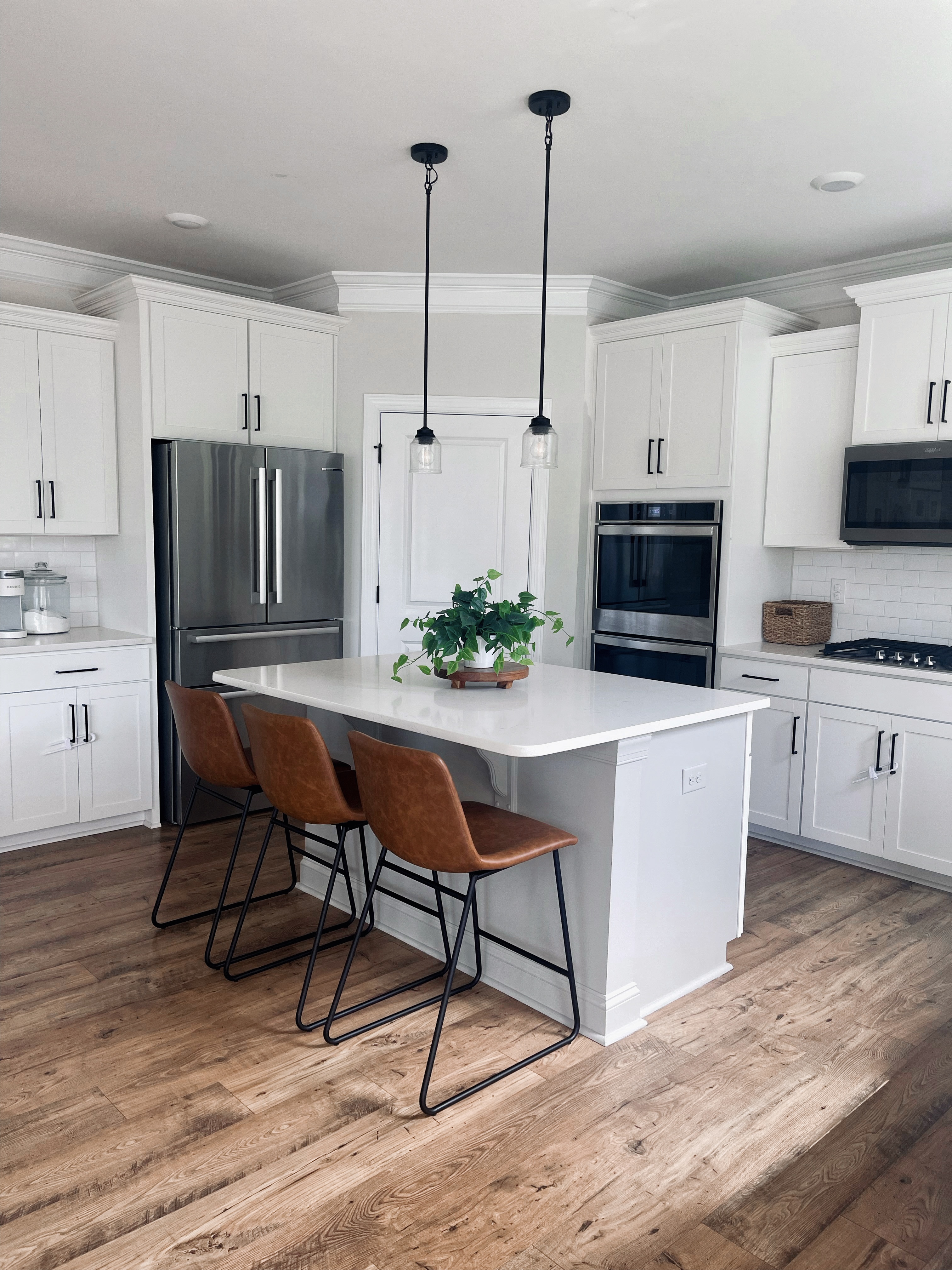
We’ve been in our new construction home for over a year now…time has flown by! I wanted to share some photos of our kitchen and the details that make it feel so bright and cozy! Let’s chat paint colors, stool links, design picks and more!
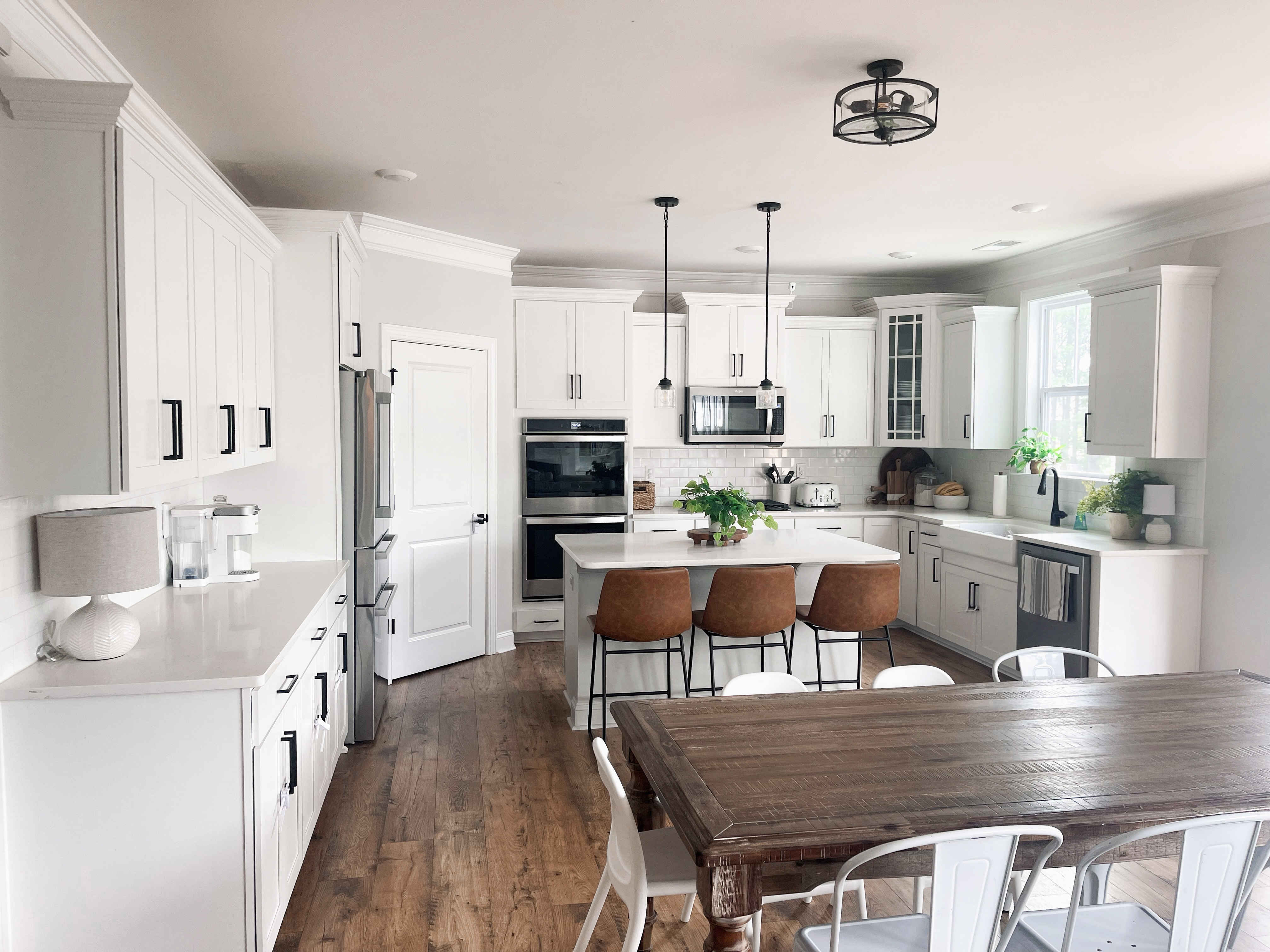
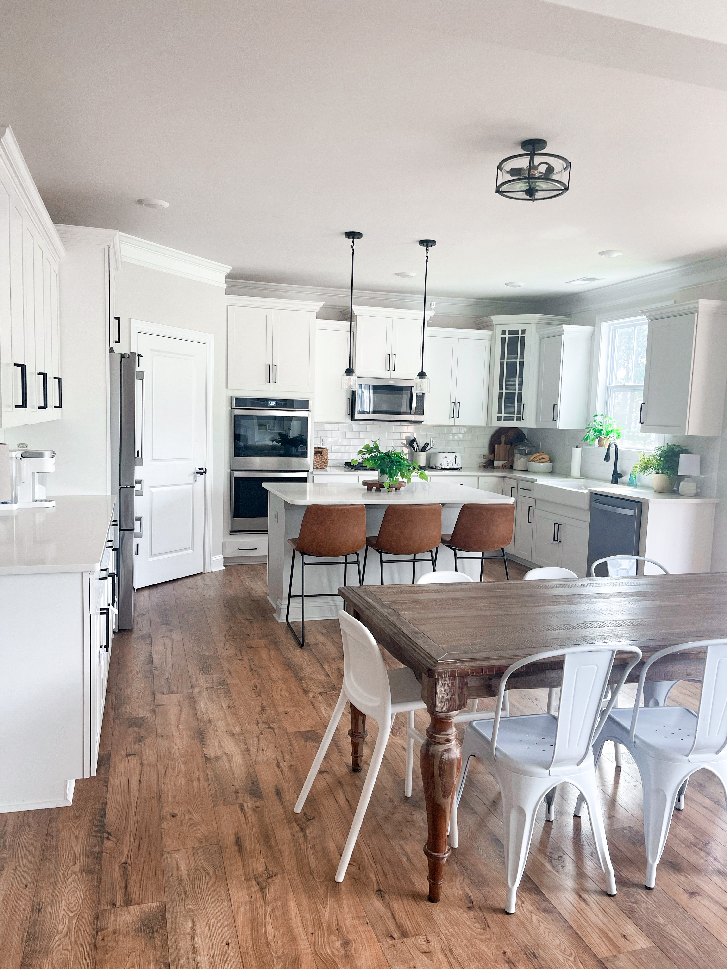
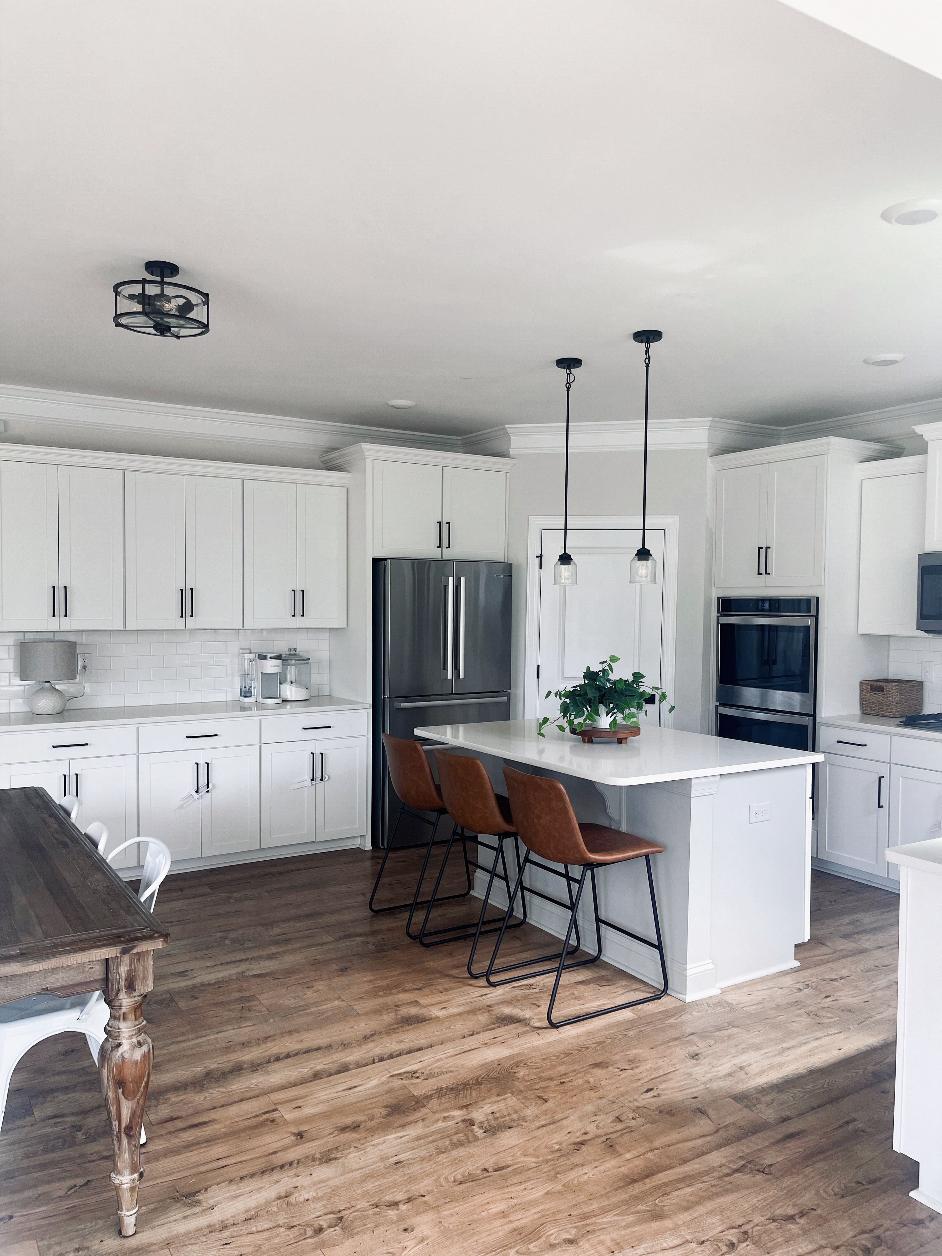
The kitchen is our home base. It opens up to the family room and I spend most of my time in this space. I’m so grateful for the bright and airy feel! When people come over to our home…I always want it to feel beautiful but comfortable. Our house needs to be functional for a family with 6 kids…but I also want it pretty. A lot of people in our neighborhood did a round table here in the kitchen, but I fell in love with this long rectangular table and knew it had that rustic touch I was looking for. I got it at Rooms To Go! We can get 10 chairs around it. The IKEA toddler chairs are so handy- easily stackable and the perfect heigh for kids. I like that when we have friends over…we have chair options for their little ones. It makes a difference to help them feel comfortable when they can actually eat comfortable! The white metal chairs were an amazon find. I have them in black too on our back patio haha. But they are great. They are easy to clean and also stackable.
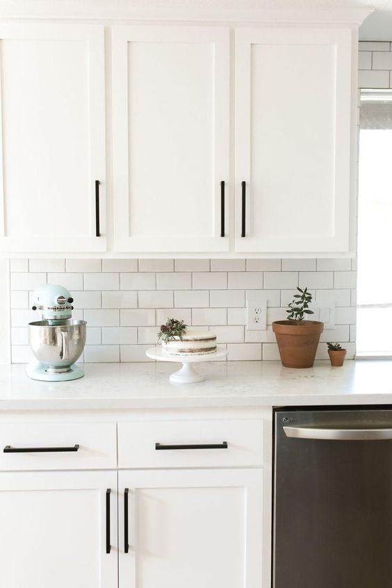
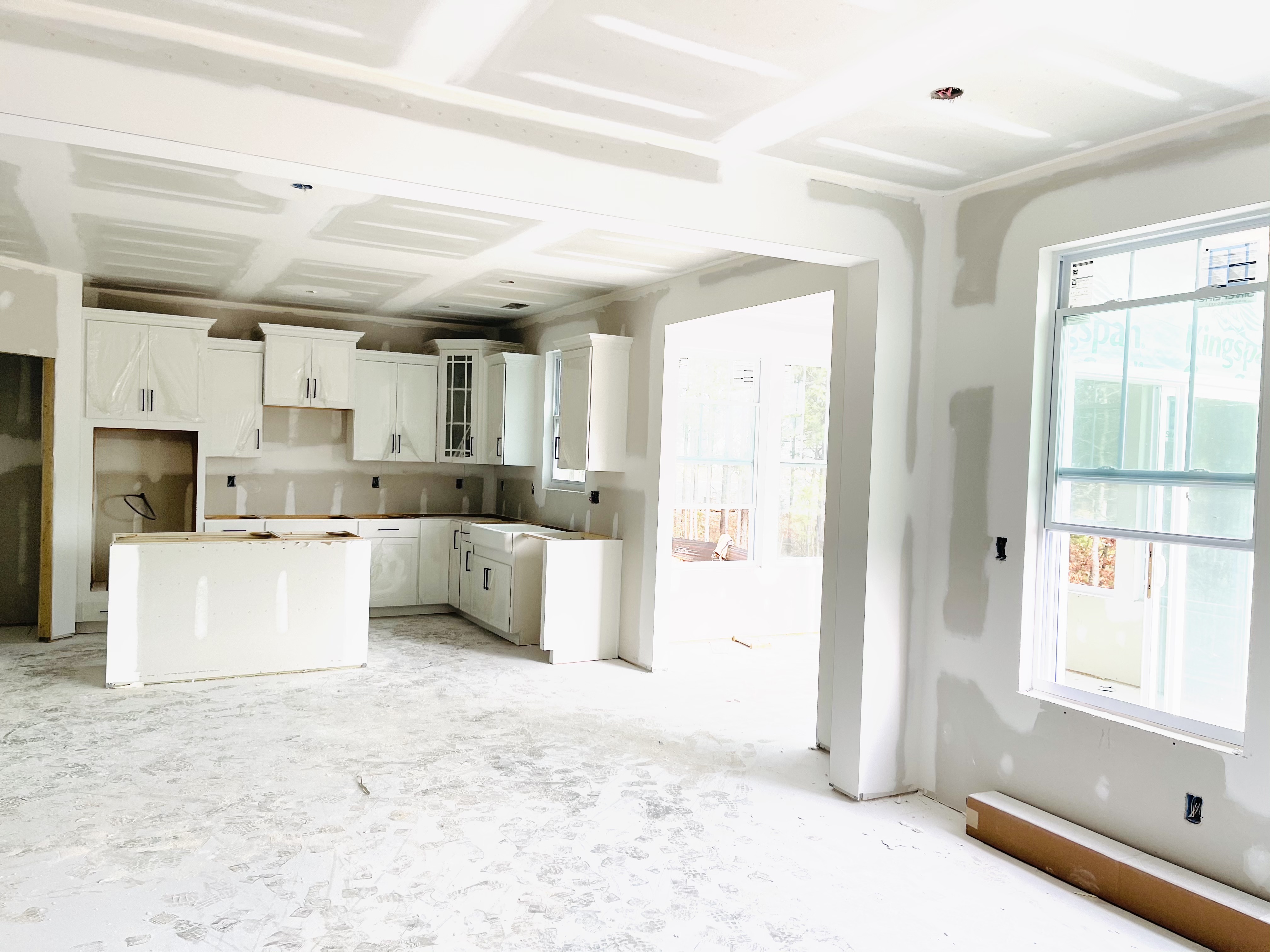
This was the inspiration photo when we were designing our kitchen space. I feel like we did pretty good!!
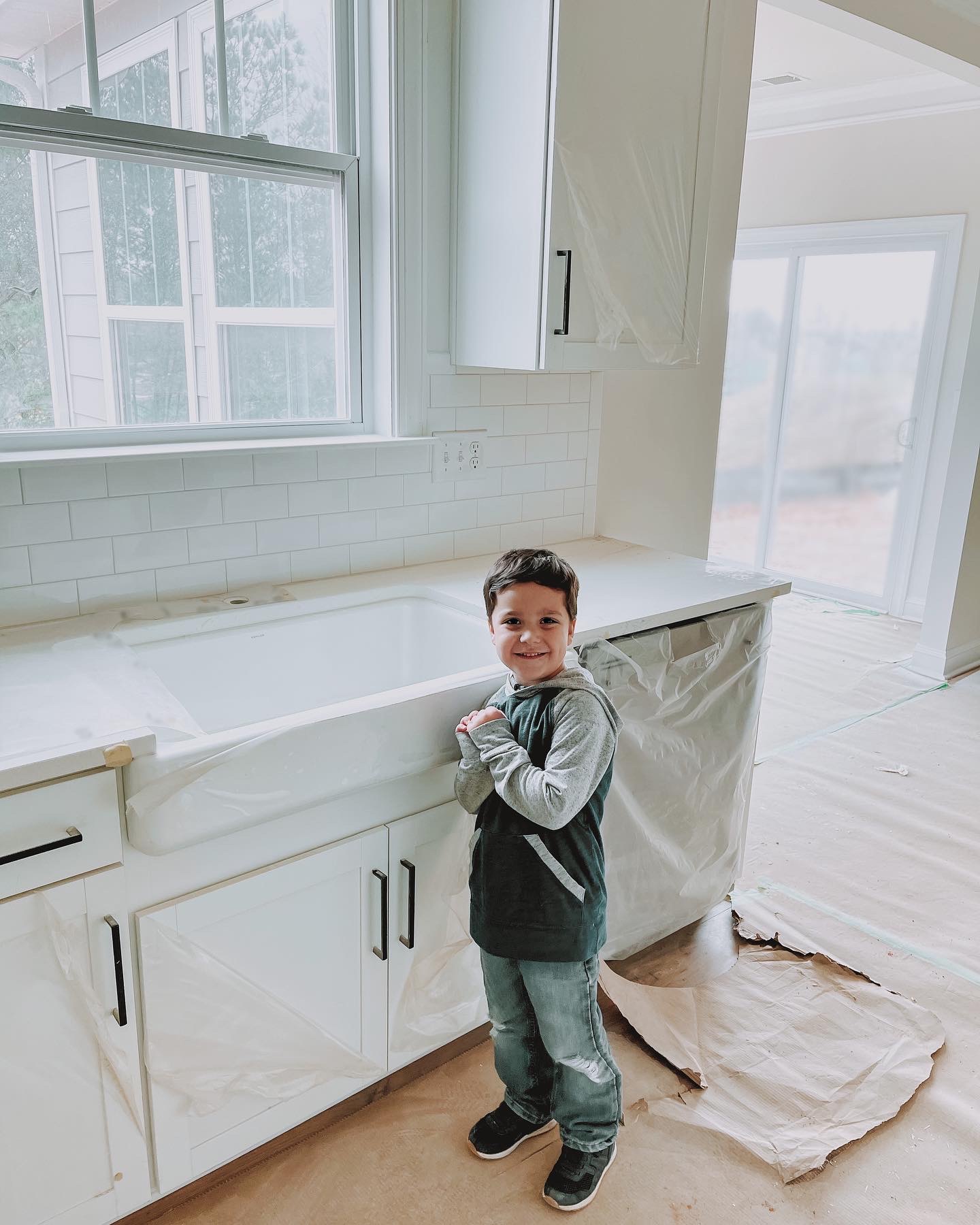
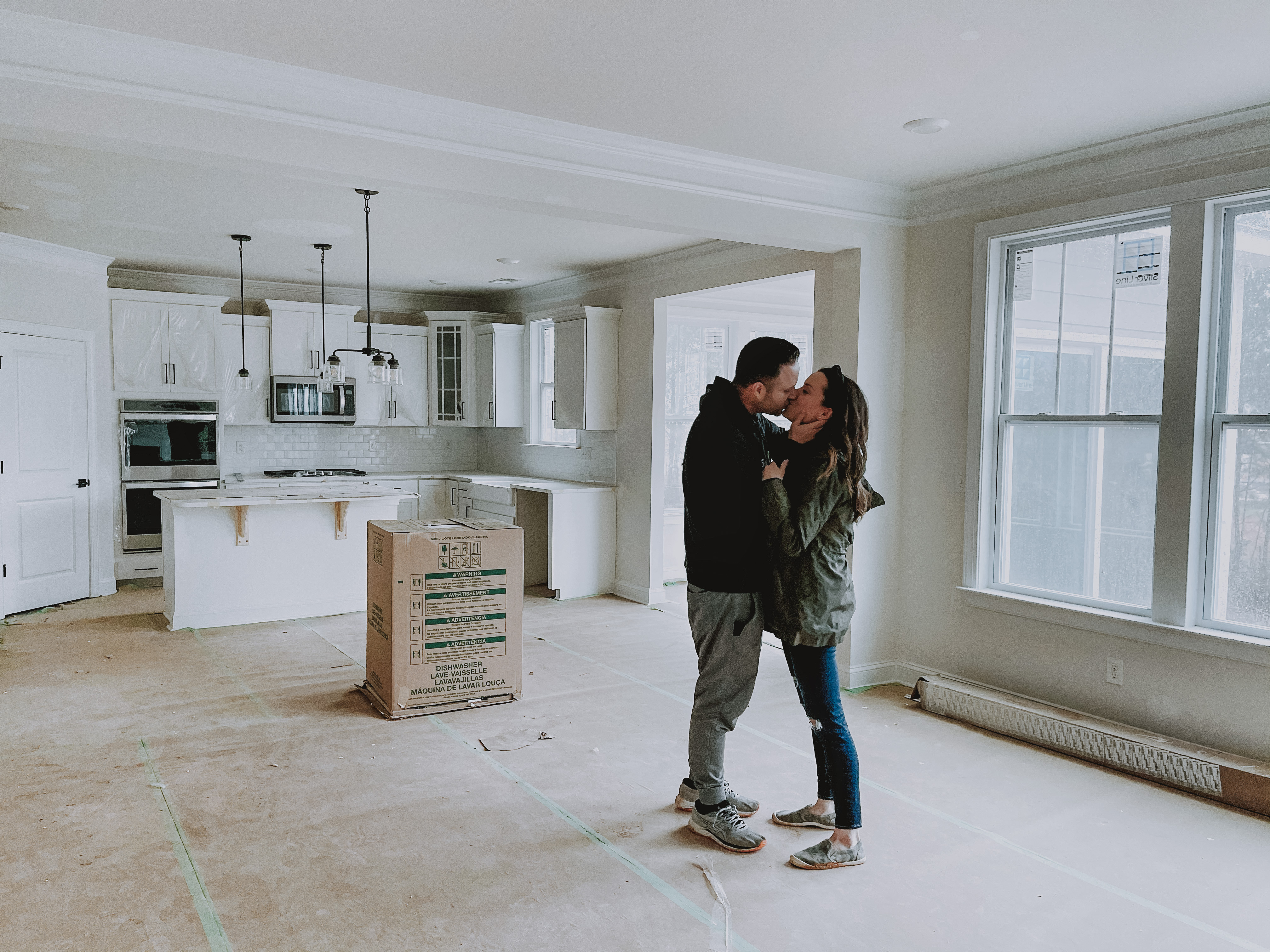
It was pretty amazing seeing the building process and the space come together.
I always dreamed of having a bright kitchen space with an island and we have had so much fun cooking and baking in this space. Can a kitchen make you tear up?? yes. yes it can. haha. grateful for the memories we’ve made in this space and excited for more!
I painted the kitchen a soft gray color to make the trim and cabinets pop. It’s Sherwin Williams Basalt Powder. (I still have some spots to paint lol. I’m trying!)
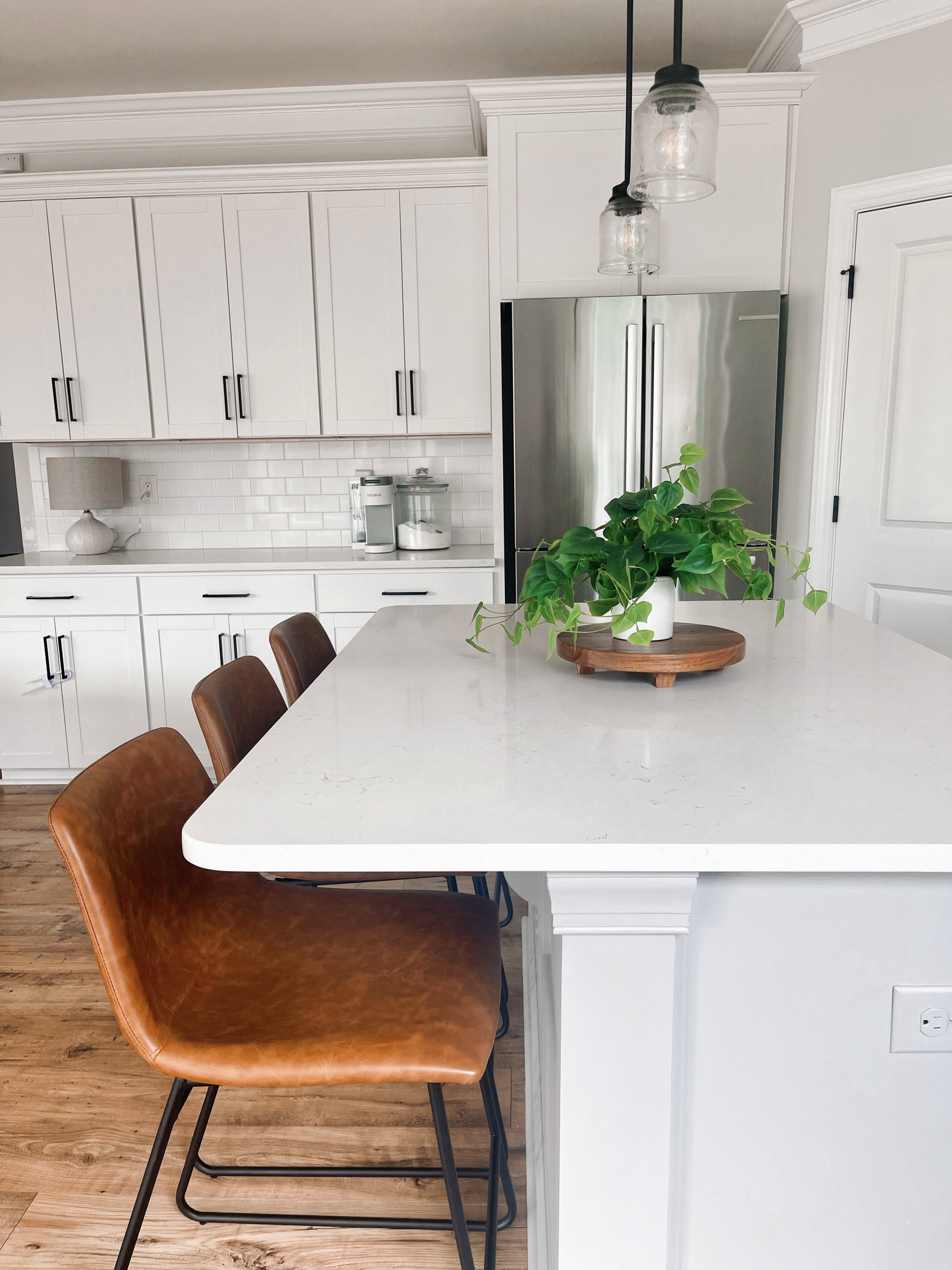
For the island, I wanted a coastal feel and went with Sherwin Williams Mindful Gray. I love the slight contrast to the white and how it looks with the leather stools.
I had originally painted the island black…I loved the look in photos I saw. BUT once we had our first Holiday with the dark painted island, it just felt too distracting. I love to do balloon garlands and have themes for parties…and needed a more neutral base. I do love the pop of black paint in spaces…so I think we are going to do it just somewhere else in the house!
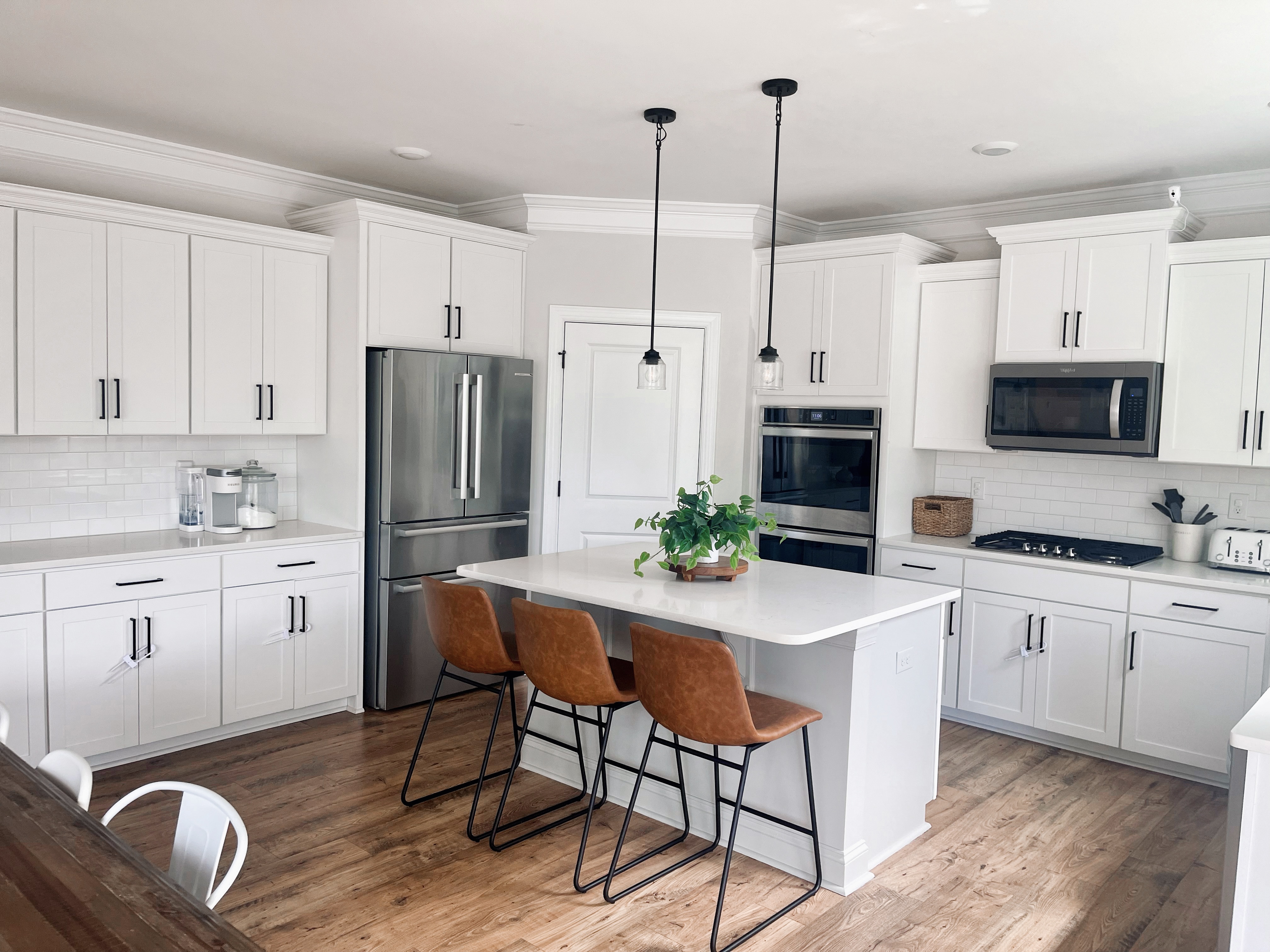
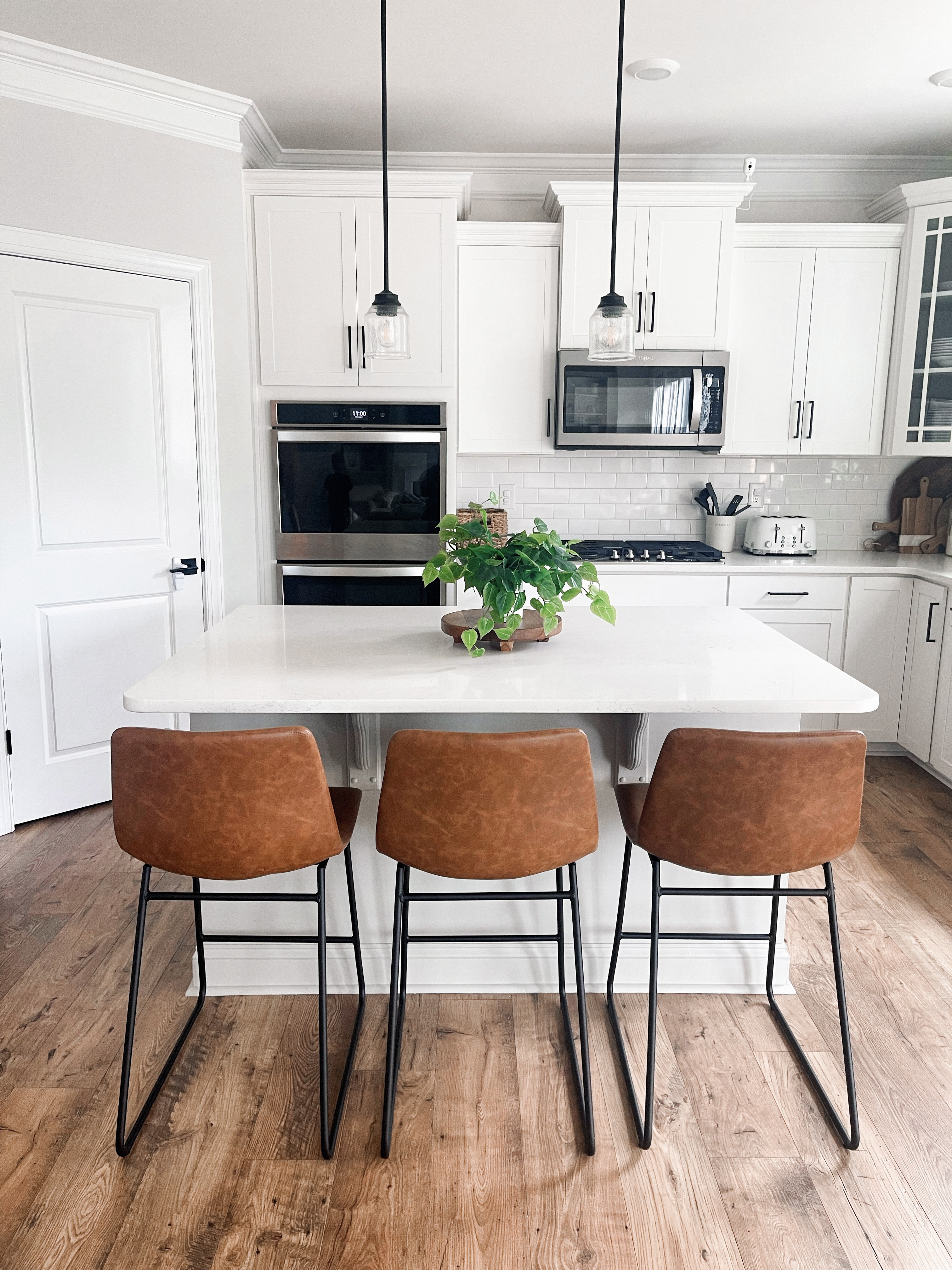
I have always wanted an all white kitchen, but I love the earthy touches to warm it up! I went with these COMFORTABLE and pretty leather chairs from Target after seeing them in my friends’ house. They are so sturdy for our 2 year old to climb up into. I don’t have to worry about tipping. The island is where everyone ends up when we have company over…so I wanted comfortable chairs for people to sit on! I think that 2 would probably be more “appropriate” for this island size….but we needed 3. And it just is more functional for us!
When we moved in, there was a hanging 3 light fixture over the kitchen table..but it wasn’t centered in the room AND we needed a long table to fit out crew! ;) SO to make it work better in the space…we switched out the hanging light to one flush to the ceiling and it really opened up the space even more! Allen + Roth 3 Light black semi-flush mount light. Now the table doesn’t necessarily have to be centered and low light fixture doesn’t block the view of the island when you first walk in. I would love to eventually update the light pendants over the island….and maybe add a light on the wall above the sink. Not sure if it’ll work with the trim but I have seen some cool ones!
We haven’t installed under cabinet lights yet…I really want to! But until then, I wanted to add some lighting to the space in another way. I saw this cute little lamp at Target and knew it would be the perfect size for the countertop. I love having the glow of the lamps as the sun goes down. Lamps add cozy! I realized, watching my favorite tv dramas, that the homes I loved the most..all had layers of lighting! try it in your own space! (Below’s a photo with the lights on. :)
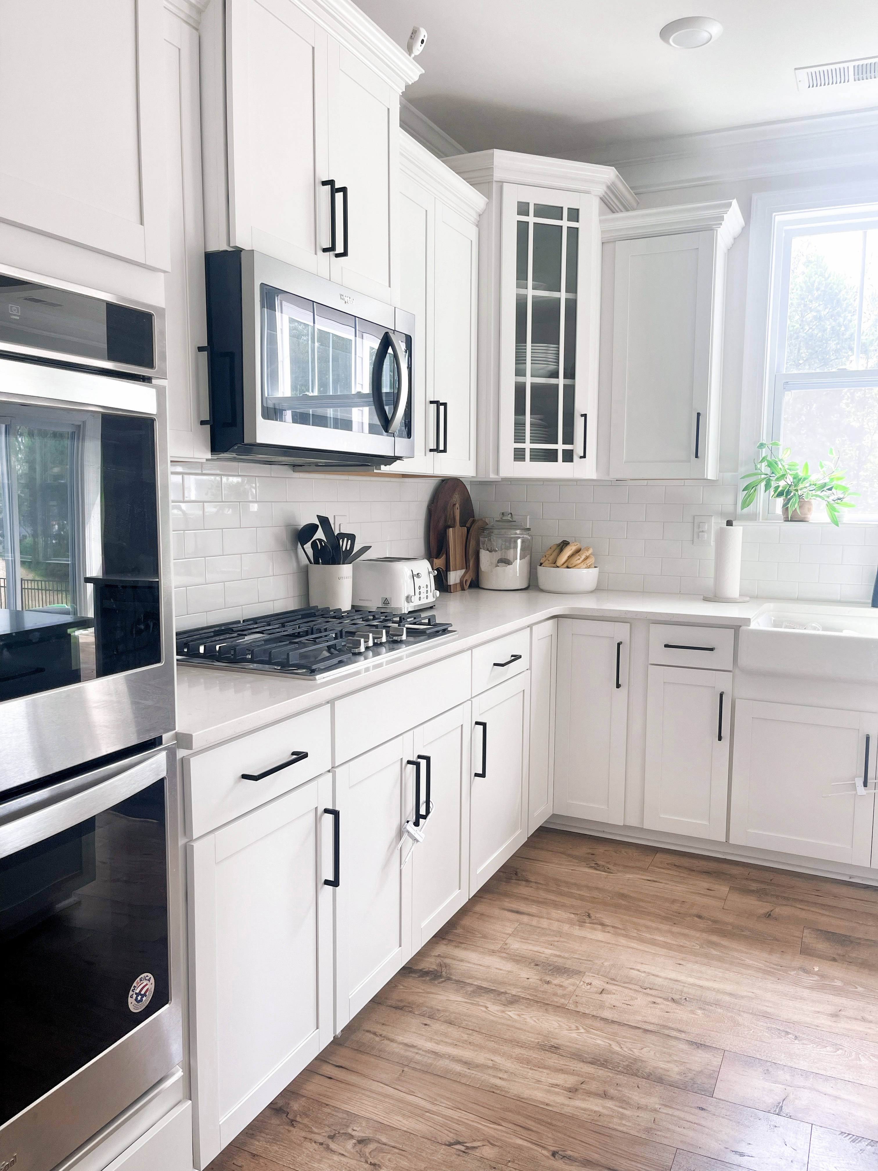
If you’re designing a kitchen and have the option for double oven… go for it! It’s SO handy!! Not just for the holidays…but when you’re feeding a crowd, baking all the things or wanting to work up dinner even faster. During the design process, with our budget, we had to choose between doing a hood over the stove or doing the double oven. I’m so glad we went with the double oven. We have the electrical set up over the stove so we could always eventually update that with a hood and move the microwave…but I’ve even heard from friends in the neighborhood that they wished they did the double oven instead of the hood. Throwing that out there in case you’re in the decision making process at your home.
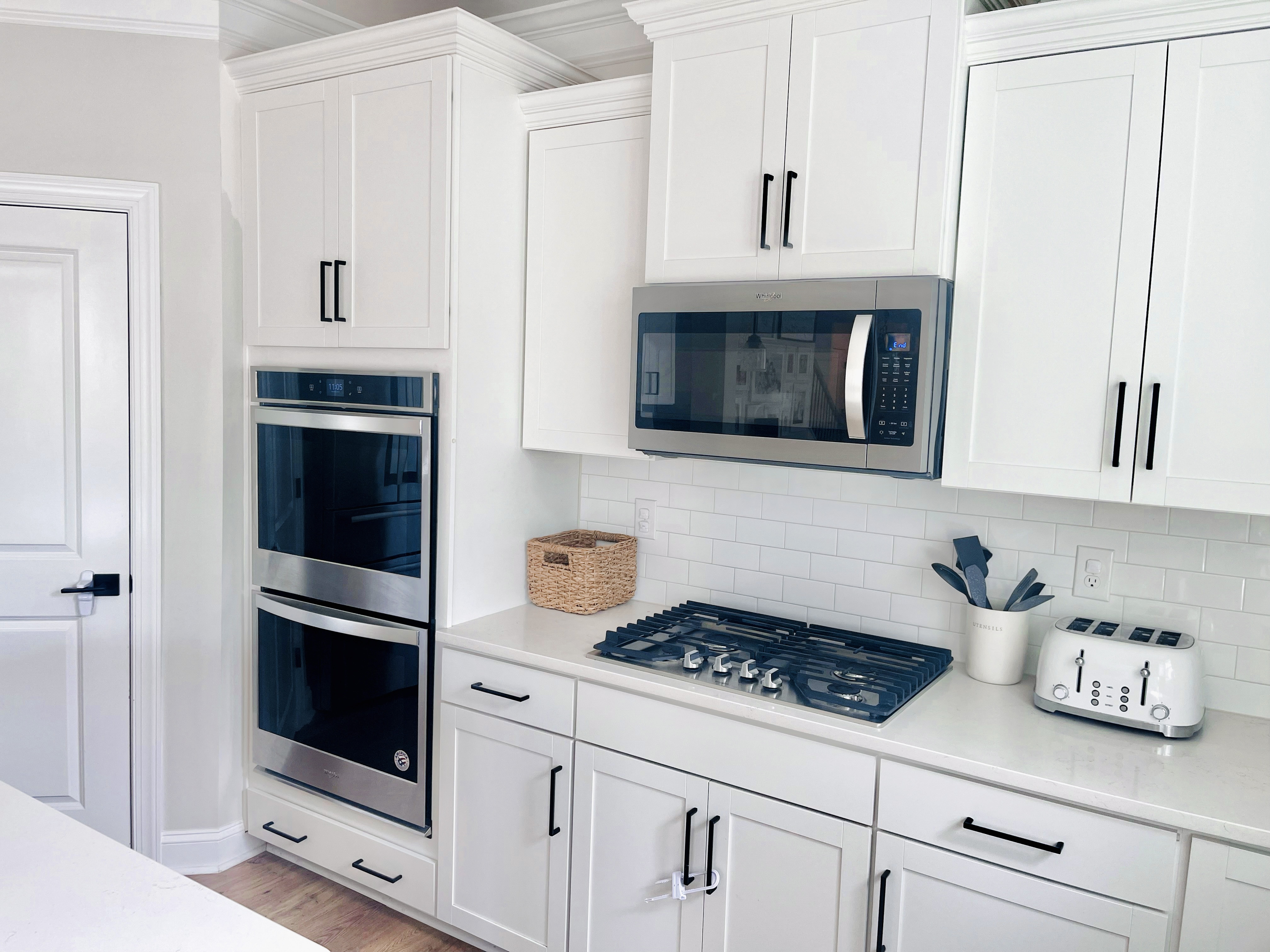
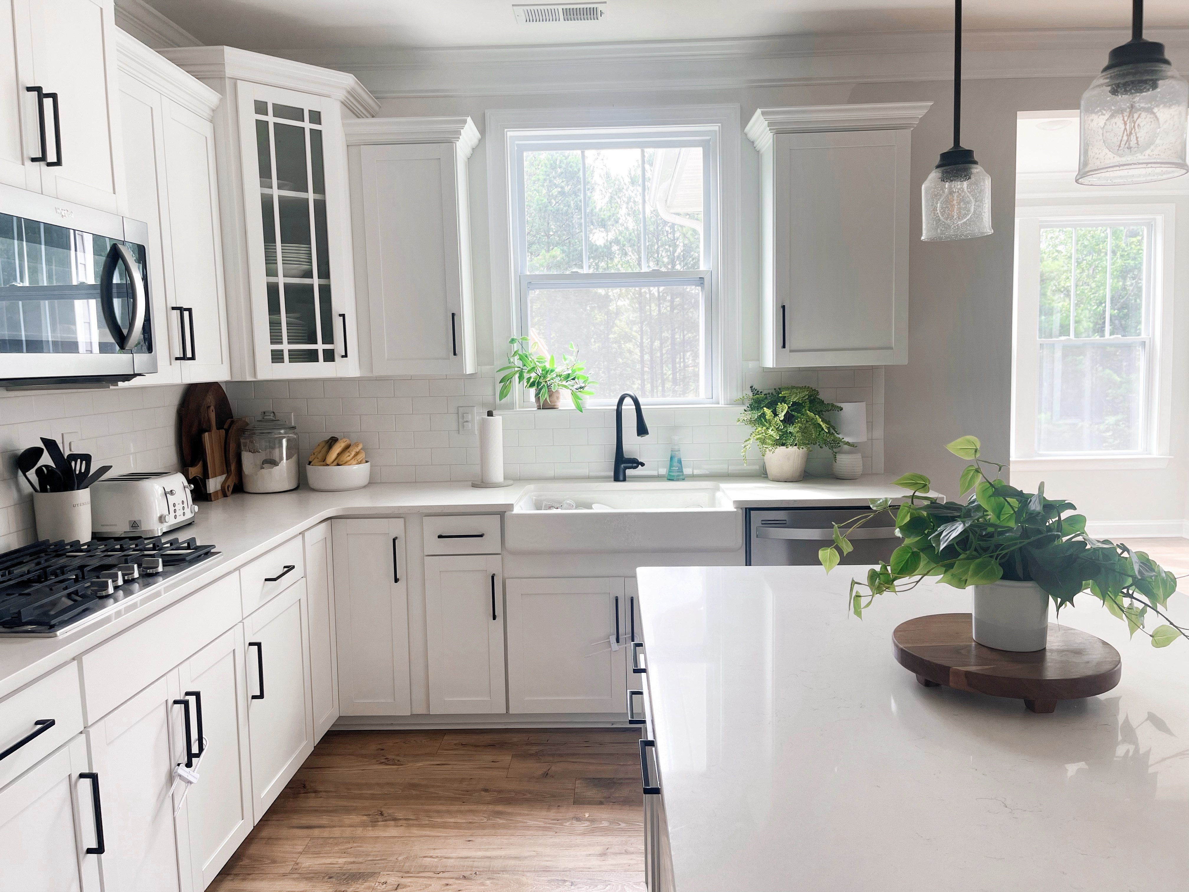
The toaster is a favorite find off Amazon. My boys LOVE Bagels and toast…I needed a 4 slice toaster to help speed up the breakfast prep. ;) It had just the right look and has held up great to being used non stop. haha.
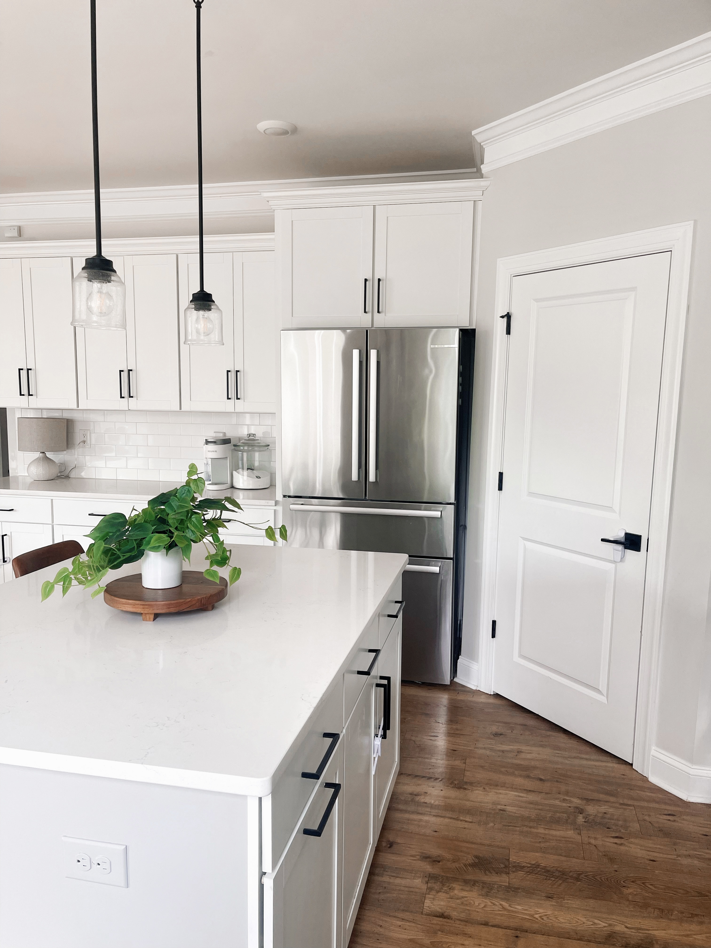
Our fridge is one of the things people ask us about on Instagram. It’s been so nice! It’s the Bosch 800 Series 21-cu ft 4-Door Counter-depth French Door Refrigerator with Ice Maker. I love that it’s so sleek on the outside..and then the filtered water feature is on the inside left when you open it up.
When we were doing our home build – I knew I wanted to do the subway tiles. Call me basic but it’s just what I love! haha.
Our floors are Mohawk RevWood in color Fawn Chestnut. OBSESSED with them. They add that perfect earthy warm touch to our home but also are amazing at hiding the dirt. I have had dark wood floors in past homes and it was always a nightmare keeping them clean at all times..cause they looked dirty so easily! This color…is magic! haha. Not gonna lie though..when making our design picks..it was a stressful one. I had seen photos of it on Pinterest but I just didn’t know if it was going to go too yellow in the space or too “rustic” but it was PERFECT! I think it can go with so many different styles..farmhouse…modern…coastal.. it’s gorgeous!
The farmhouse sink was another must have on my kitchen design list. I have always loved the look and it’s something that house guests always comment on- It’s just pretty. ;)
The countertop we chose is Carrara Marble. I love the neutral clean look and it really helps keep the space bright!
Our space is a family space! I have things out on the counter to help us function well as a family. The basket has paper plates in it. The Keurig is my quick sanity saver ALL DAY. (I love the slim white design of it.) Our kitchen looks nice and clean right now but trust me…it’s lived in and plenty of times the counters are covered with dirty dishes! haha I documented clean countertops but the sink still has dirty dishes in it. haha.
It’s pretty wild thinking back to where we began in this space! If you’re in the building process… hang on-it’s so worth it!
Let me know if you have any other questions about the space. Thanks for stopping by!
You can also stop by our Instagram to see our daily posts. @athomewithnatalie
